| Forums/ The 7th Continent/ General40 posts |
|---|
|
Posted - Edited
The Fan Kit has been quietly added to the downloads page.
 For the most part, I think it's excellent, but there are definitely some oversights and issues, as is to be expected with the first version of anything. I'm creating this thread in the hopes that the fan community can gather all their feedback into one place, so it's easy to process. ----- Edit from Firebird (moderation) Thank you, Brisinere, for this useful topic. I edit some details for a better annoncement but you rock. Posted - Edited
I'll start this off with a simple one:
Action_back_Clue's English version is misfiled as French. Action_back_Clue's french version is missing entirely (the nominally-english Clue is in fact a french Curse.) The English Adventure_Conclusion (THE END) is misfiled as French. The French Adventure_Conclusion (FIN) is misfiled as English. Posted
Nice :) I'll surely use this.
Some suggestions for additional resources: - the brown card back used by the "Satchel & Journal" and "Pocket Watch" cards. - the front for non-action deck Skill cards (like Octopus Mask or Bird Mask) Also more "blocks": - parchment (used on Clue cards), - non-flavour text used on the back of cards (e.g. when you return the card and take another using a banner) - "torn out squared paper" used e.g. on botany cards for effects - "notebook squared paper" used e.g. on botany cards as a background for plant image Posted
I've begun going through the vector icons, and have discovered a major category of those isn't in the fan kit:
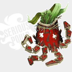
All the banner symbols seem to be missing. That is, anything that goes in a blue or purple banner, i.e, the Rope spiral, the Offering to the Guardians bugsplat. There are so many of these that if I listed them all I'd surely miss some so I'm not going to try right now. It would also be nice to have the terrain icons: Plants (Vampolina, Fragonia, Terracokus, Fortiflore) Animals (Turtle, Penguin, Seagull) Turquoise Mark Altar That weird orange tentacle plant thing I don't have a name for. Posted
To continue Brisingre's terrain icons list:
- Totem, Grave, Red Seaweed, Seed planting spot Note: I already have the blue & purple banners ready (in relatively a good quality PNG) and some of the terrain icons (Grave, Mark, Altar, Penguin, ...) in not so perfect (scan) quality. I can share if anyone is interested, but it would be nice to have official versions. Posted
I'm definitely interested. I'm working on putting together an unofficial compilation of that sort of thing.
Posted
brisingre wrote: I'll start this off with a simple one: Hi, Thank you for your feedback. The issues mentioned above have been taken care of. We'll improve this first version early November with additional icons (for blue / violet banners) among other stuff. Thank you for your patience! Bruno Posted - Edited
BrunoS wrote:
Thank you for taking the time to make this fan kit for us, and doubly for listening to feedback and continuing to improve it! I love when developers are willing to work with fans. I hope we can continue to work with you on this, to make the best fan kit there ever was. A few other things that I would like to see added in the next version: The Mastery icon (red card diamond.) I assume you're planning on adding the other What Goes Up Must Come Down stuff (fog backs, new actions, etc) in an update sometime after the expansions are released, and most of it I don't think I really have a use for until then, but I expect many people will want to use Mastery on their fan characters.  It's on the backgrounds, but it's very JPG-y. We have vector versions of most of the stuff like that, banners and stuff, but not this one which has it the worst. Also, as in this example, you sometimes need it as a seperate layer so it can go overtop of art. Right now I'm working with one I cut out of the corner of the background images and cleaned of JPG artifacts as best I could, but it would be wonderful to have this is a vector. Speaking of which, could the background images in the next version be PNG instead of JPG? JPG has really nasty blocky compression artifacts that make it look grainy in printouts. Posted
brisingre wrote: A few other things that I would like to see added in the next version: other_icon/Bad_news.ai T7Continent : T7Citadel : Posted
No, he means "Red diamond" icon - new mechainc in the upcomming expansions
Posted
One more thing: I applied the official card backs in mi mini-expansion and realized that the "Fan Made" logo overlaps the card IDs - it's in the exact same space... It's not a huge issue, but I wanted to let you know.
Posted
Firebird wrote:
Nah, I'd found that.  I'm talking about this icon that appears on Teamwork and some other WGUMCD character cards. It's called "Mastery." If the number of cards you draw on a check where you have Mastery is less than your Mastery number, you can shuffle away cards from the check instead of discarding them after the check. Posted - Edited
dill wrote: One more thing: I applied the official card backs in mi mini-expansion and realized that the "Fan Made" logo overlaps the card IDs - it's in the exact same space... It's not a huge issue, but I wanted to let you know. Yes, I've had a few issues with the fan made logo. I agree 100% with the idea of fan content being marked as fan content, but there's a bunch of little stuff that isn't great about the stamp in the fankit right now: -It covers the space used for the A0whatever card number. -It's part of the background and there's no vector version of it, so if you want to put it on top of your art you have to cut it out yourself. -It's right in the middle of the stars on action cards. It doesn't overlap any, but it still fights for space in a very important corner of the card. -Lime green doesn't look very good on a lot of the cards, especially the purple ones. In the most extreme cases it can really ruin the look of a card. -In general it is very "loud." It's pretty big, lime green, has all-caps, attention-grabbing text, a funny face, and look-at-me spikes. Often, it is the most attention-getting part of the card, which is not great given that it's actually one of the least-important parts of the card (it doesn't have any impact on what it does in-game.) If it were a separate file instead of part of the background, this would all be fixed. People could layer it with their art, position it to avoid the important information on their cards, and tweak it to suit their unique needs. I don't think you have to worry about people not making clear that their cards are fan-made -- it's very clear in the readme that we should make very clear that fan content is fan content, and I don't think anyone has a problem with that. It's just the inflexibility of having it built into the backgrounds that isn't ideal. I've been working on a set of templates that includes some less-intrusive alternatives for my projects- still clearly marked as Fan Made of course. Posted
A few other missing things:
 This banner (we have the bottom half but not the top half. Built into backgrounds, but that's not ideal b/c it has to go overtop a full art card on curses at least.)  This box (also exists as part of a a background, but has to be layered ontop of art on state cards.)  Only one textbox exists in both success and failure versions. The other 4 sizes only seem to exist as one or the other. Posted - Edited
It would be useful to also have pure versions of card backgorunds (such as Adventure_front_Item_keyword.jpg or Adventure_front_SideQuest.jpg)
- with no keyword box at the bottom - because many cards not have keywords (items, side quest result) - with no title banner at the top - because a card may need wider (or even higher) title banner I hope we don't seem ungrateful requesting all these extra assests What you have already provided is great, thanks again. Edit: Also cards without title banner are useful because the banner is sometimes over the graphics of the item or Clue Posted
dill wrote: It would be useful to also have pure versions of card backgorunds (such as Adventure_front_Item_keyword.jpg or Adventure_front_SideQuest.jpg) I'd second the request for fully blank backgrounds with absolutely nothing on them. I'd also like to second the sentiment that I hope we don't seem ungrateful. It's amazing that you did the fankit at all, and it really is very good already. I'm just really enthusiastic about this, that's all. Posted - Edited
 Can anyone identify this font? I think it's also used for the roman numberals for area numbers. I don't think it's one of the ones mentioned in the readme, or in the other threads about fonts. Working theory is plantagenet cherokee, and I feel pretty good about it, but it'd be nice to have official confirmation. Posted
brisingre wrote:
Hi, It's plantagenet cherokee indeed. We'll add this info with the revised version. Bruno Posted
Speaking of fonts, there is also this one:
 It's very simillar to Plantagenet Cherokee (and hard to identify since there is only "A" and "B" letters). (Also the red "variant" icon could be added to the Kit.) |
| Forums/ The 7th Continent/ General40 posts |
Forums
Latest topics
Going from one threat to another.
by Naalball -
Updates for this website
by Firebird -
Missing Cards A001-A0026
by ewallace -
Official APP remarks (Android)
by schleima -
using skill cards multiple times possible
by IthilAlqua -
The Dark Chest of the Damned - HELP!
by brisingre -
Classic Edition plus expansions
by brisingre -
"Return this." for the top card in a combined item...?
by sgbeal -
Veins of The Earth help
by Jenoneill0524 -
Expansions with Classic + WGUMCD
by BrightSalsa -


